Business Objectives
Craft an omni-channel (but digitally driven) experience for Libro’s emerging market segments i.e. individuals between the 18-35 of age who reside in urban south western Ontario, with a primary focus on 25-35 year olds.
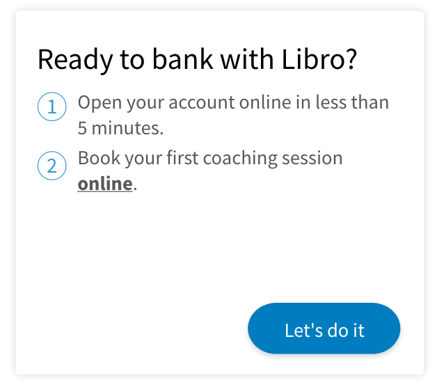
Hard convert 500+ prospects individuals online in the first year from launch.
Revamp the retail web retail banking experience for the entire website within next 2 years.
Restore Libro’s status as a Digital leader in the Credit Union space and a fast follower in the industry overall.
Problems
Our team identified several existing pain-points in the current experience.
The website had a bounce rate of 80%+.
Conversion rate remained under 5%.
User testing indicated poor information layout and dated look and feel resulting in loss in credibility for Libro.
Opportunity to optimize the number steps before a prospect onboards. Make the experience more rewarding overall.
The need for the potential solution to be scalable and consistent.
My Role
Identified, invited and worked with cross-functional stakeholders during the ‘Discovery‘ phase.
Facilitated a design sprint/journey mapping session to gather the teams’ insights before the ‘Build‘ phase.
Introduced non-UX stakeholders to the principles of Human-centred/User Experience Design.
Created a User Testing plan including surveys, script and scenarios.
Built prototypes (Lo-Fi, Mid-Fi and Hi-Fi), tested with users and internal stakeholders to iron out any friction before the ‘Development’ phase
Built an upgraded (UI) design system using Libro’s existing brand guidelines. Made sure it is scalable across Libro’s platforms.
Recommended content, voice and tone to the Digital Marketing team.
Built developer-friendly assets for a smooth design-developer hand-off.
Leveraged Adobe XD to build prototypes, UsabilityHub for user-testing, Microsoft Team and Sharepoint to share and gather feedback.
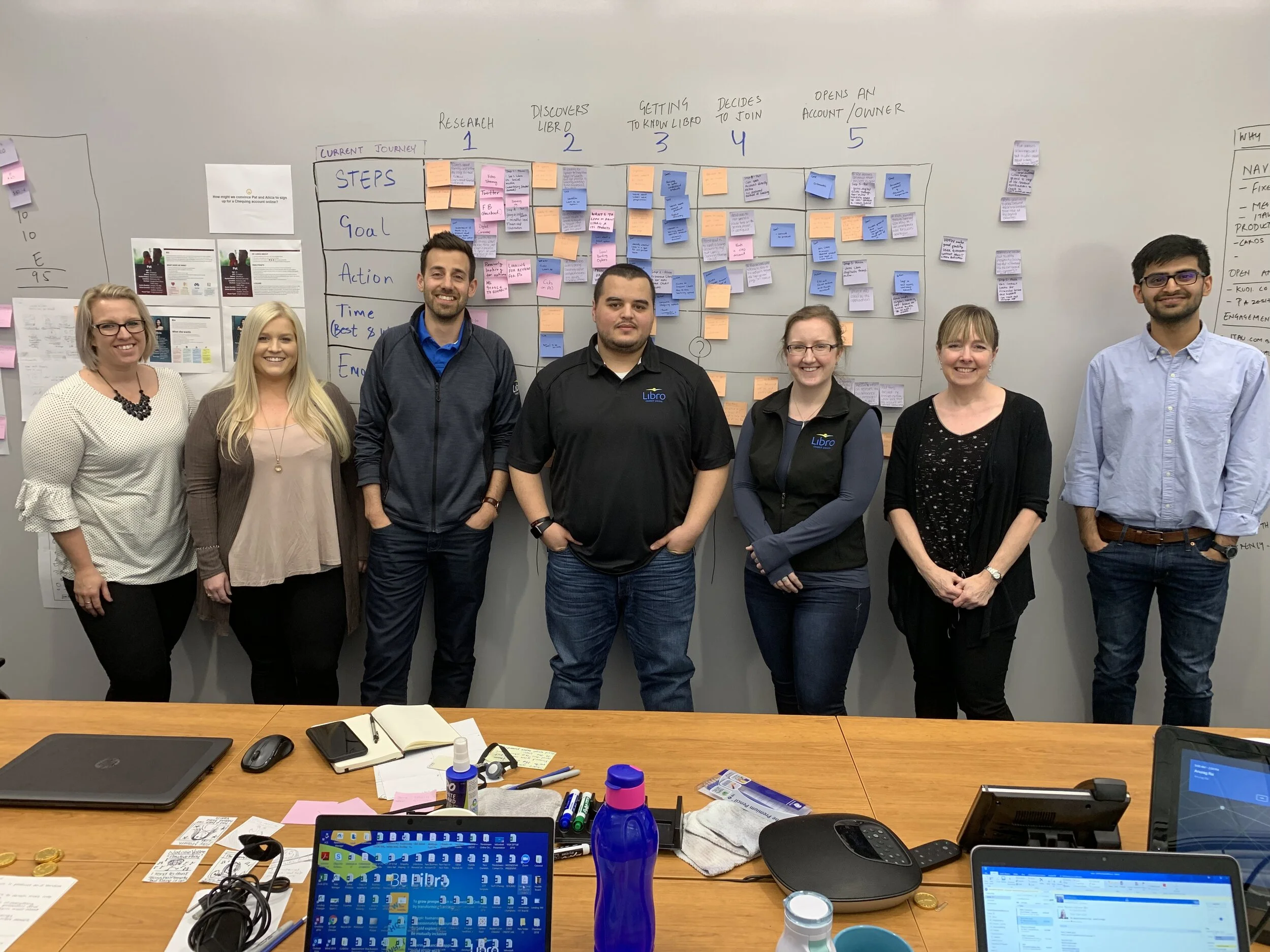
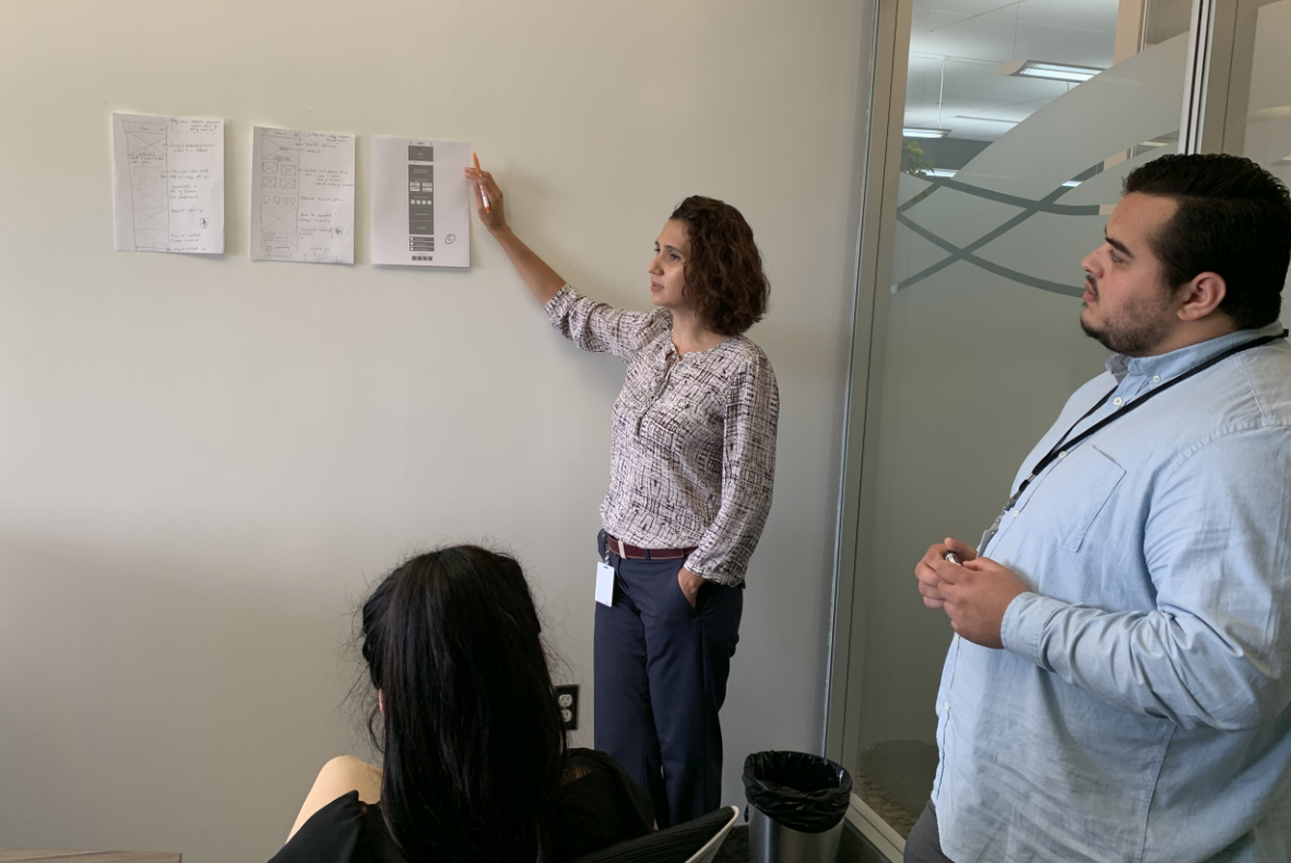
Our cross-functional team during the journey mapping/Design Spring session.
Solution
Our team took a phased approach to this project. We broke down the entire scope of the project within four different segments.
Phase 1 - Build a user journey to buy a Chequing product. (3 Months)
Phase 2 - Build a user journey to buy a Savings product. (1 Month)
Phase 3 - Scale the journey for every product Libro offers. (6 months)
Phase 4 - Roll out the new design across Libro’s entire website. (1 year)
OLD vs. NEW DESIGN
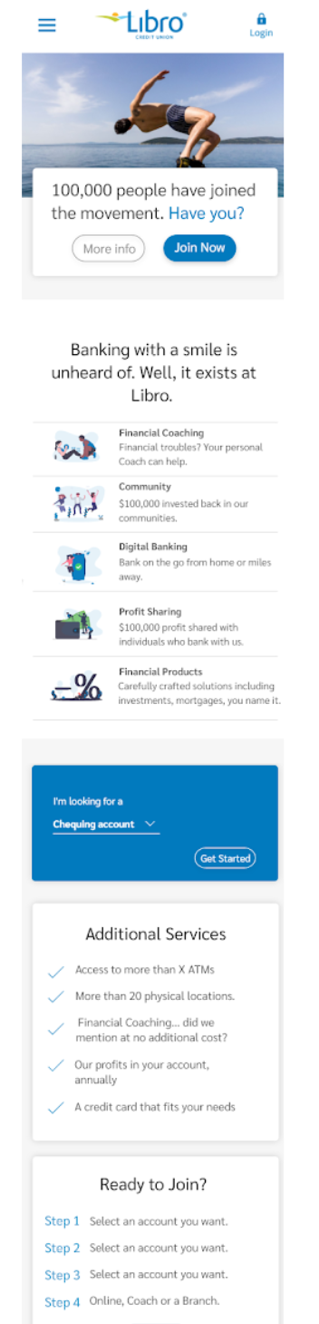
Current Design
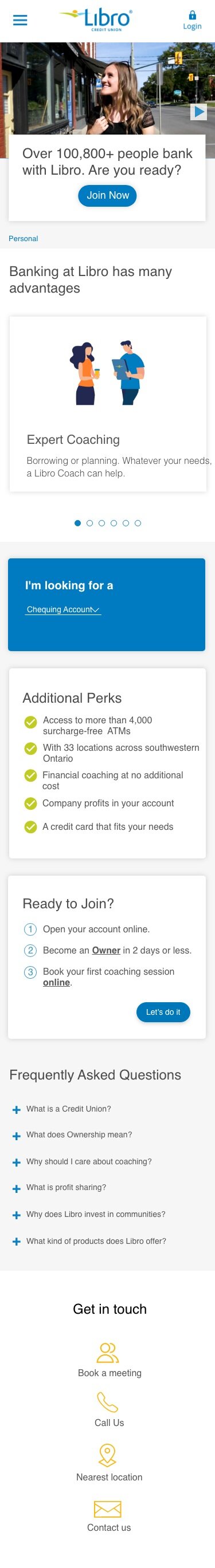
Updated Design
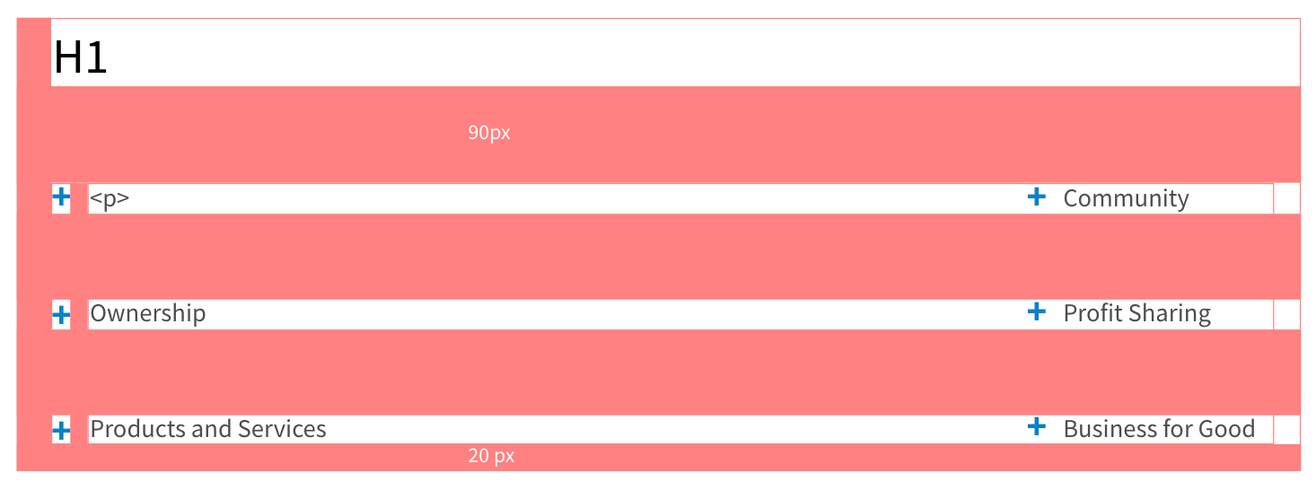
NEW UI ELEMENTS
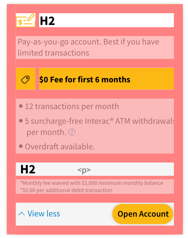
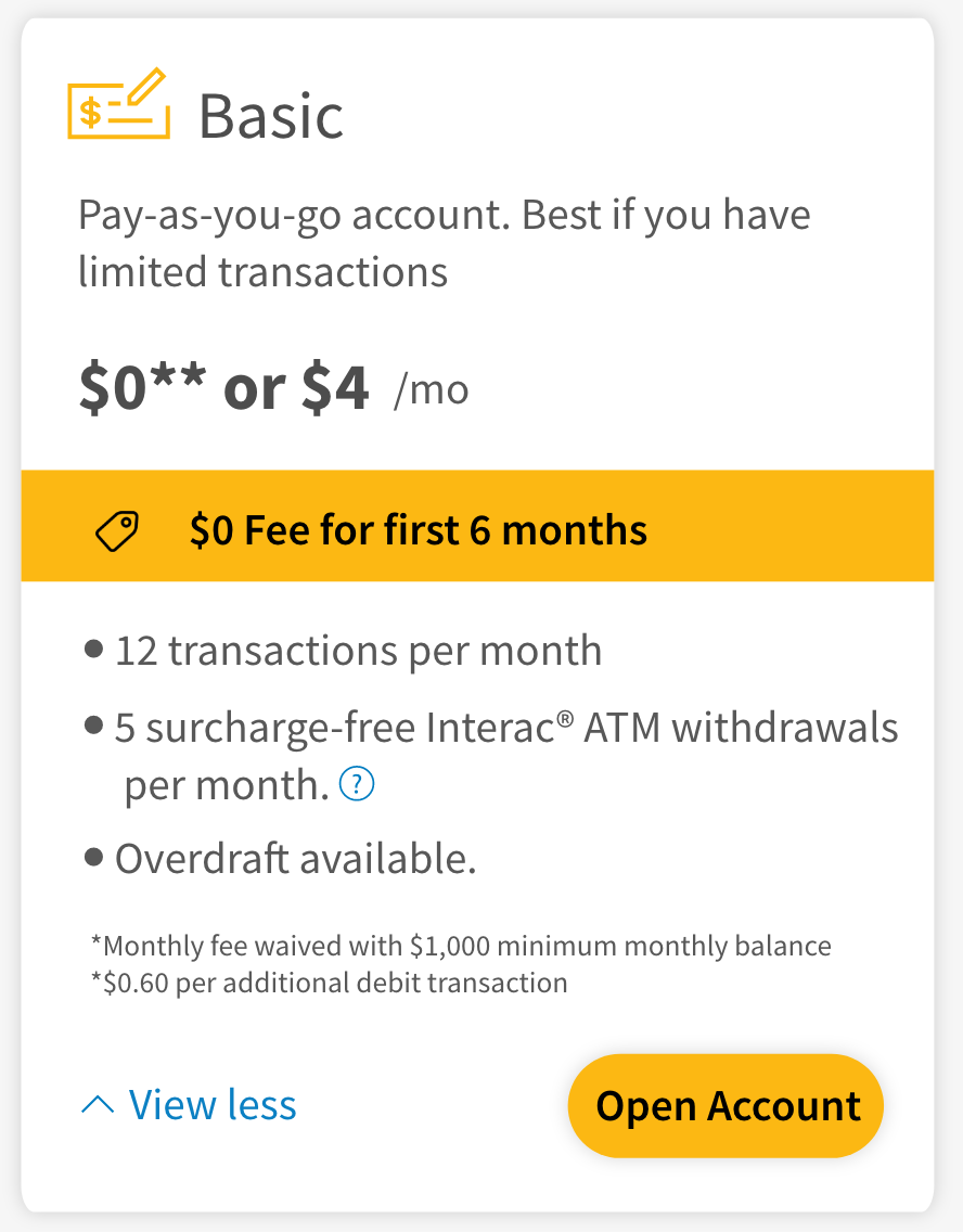
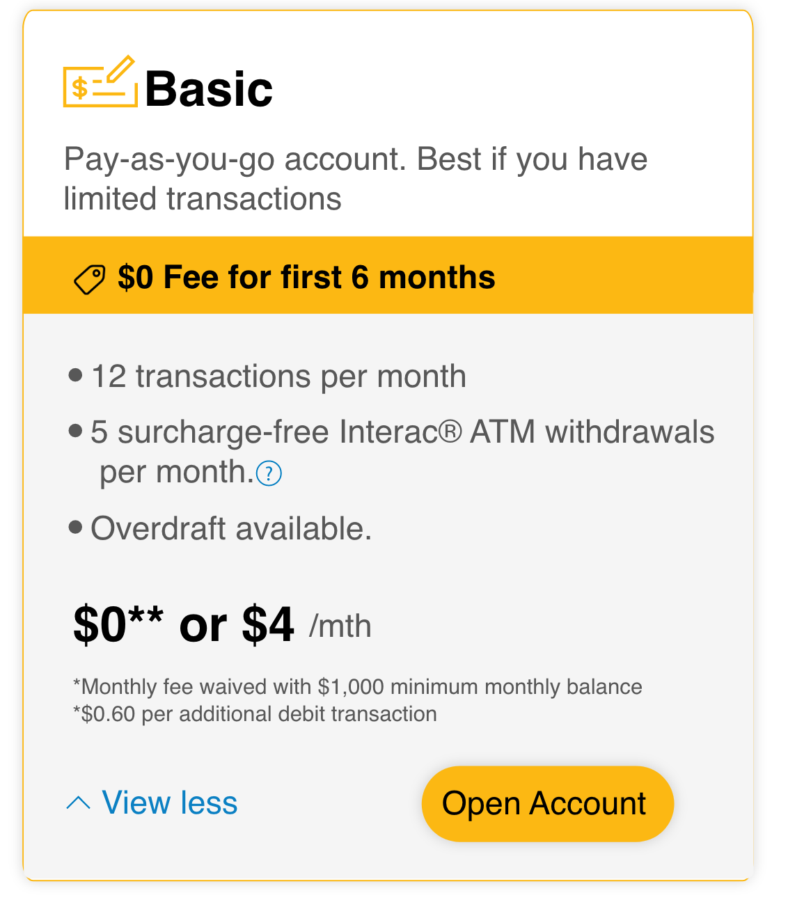
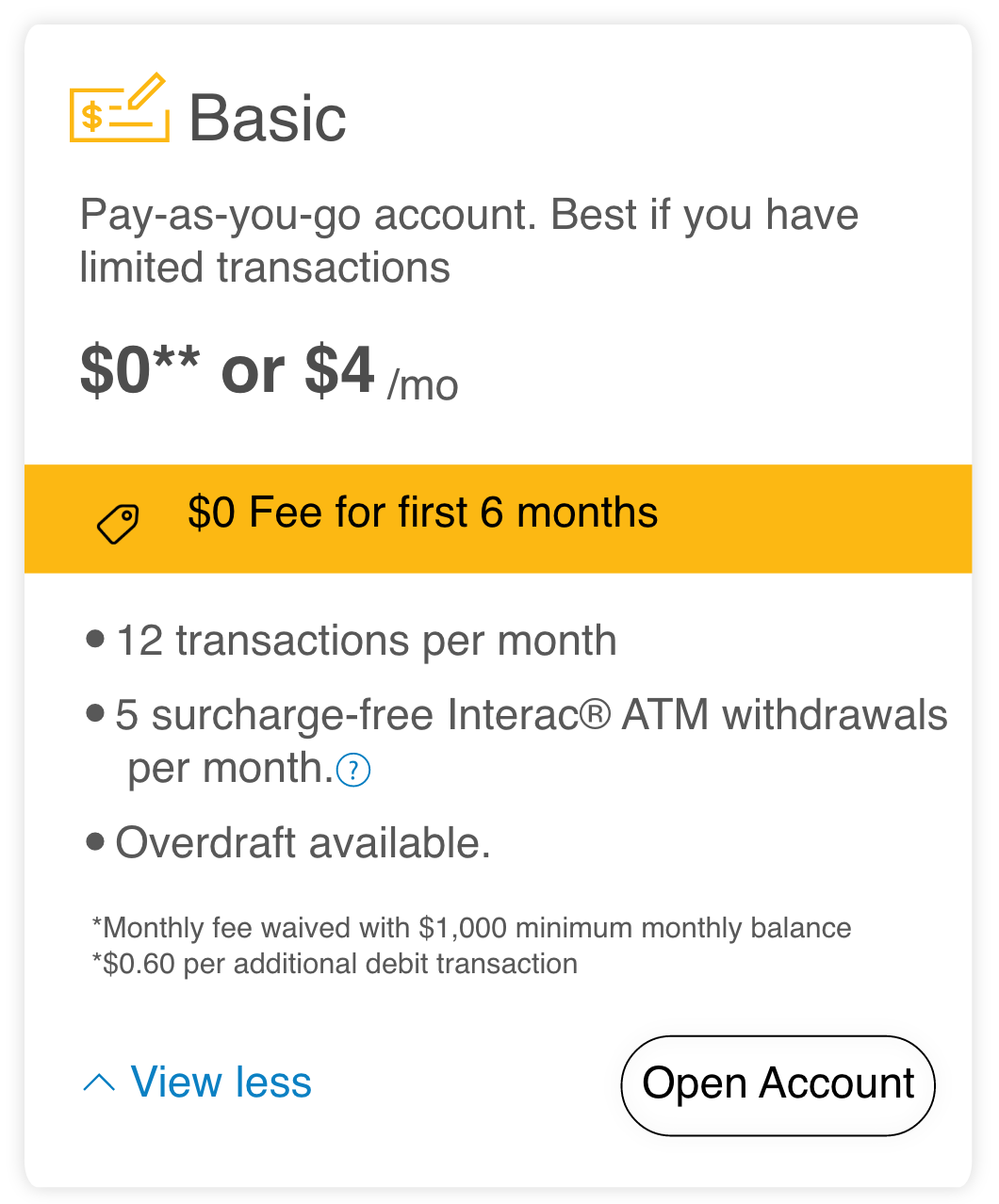
Product Cards
Responsive areas (in light red) to accomodate more content.
Ability to put a promotional banner up.
Information flows for high-level to finer details.
Tooltips to contain additional information.
Collapsable to maintain the overall layout of the page.
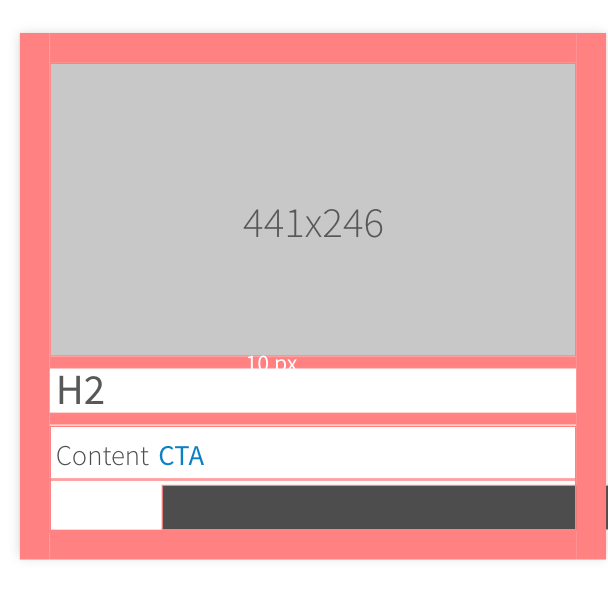
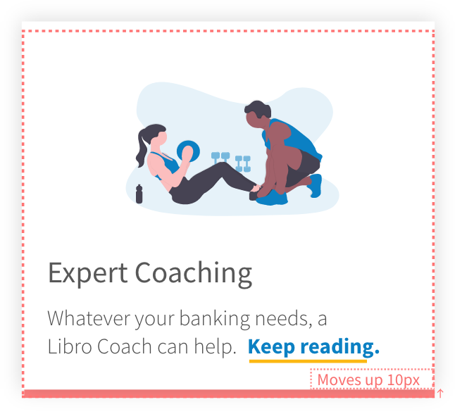
2. Image Cards
The call-to-action expands the respective FAQ accordion menu at the bottom of the page.
Text and images customizable via CMS.
Can be used independently or with multiple image cards.
Can pull the metadata from another page and display a summary with image. (eg. can be linked to blog)
Hover state highlights the CTA and moves the card up as a realtime feedback to the user.
3. OTHER NEW UI ELEMENTS
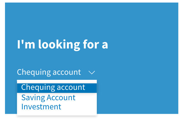
Product Selection tool
Information Card
Header title card
FAQ accordion menu
PROCESS
Target Market
For this project I was designing for our primary persona Pat and secondary persona Alicia.
These two personas were boiled down from Libro’s market segment research.
I conducted user interviews to solidify these personas and document their lifestyle relevant to Libro’s Business.
Our team solves most of our problems for these two personas (or target markets).
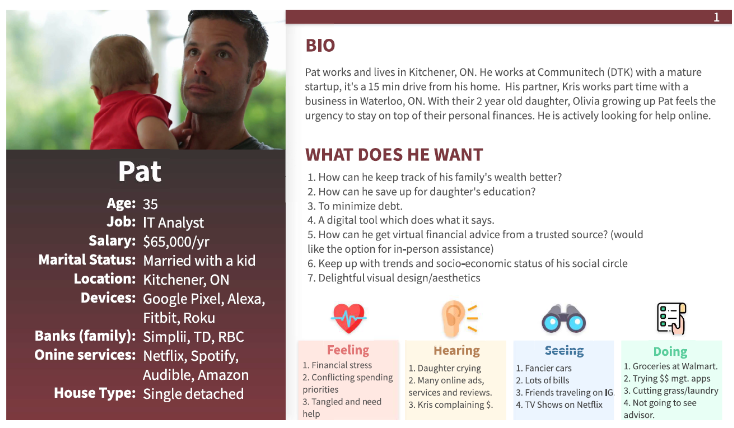
Primary Persona
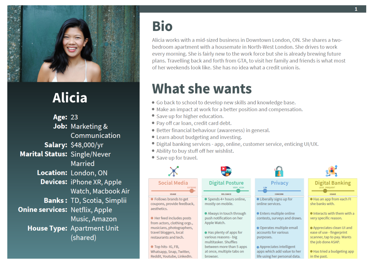
Secondary Persona
2. Design Sprint
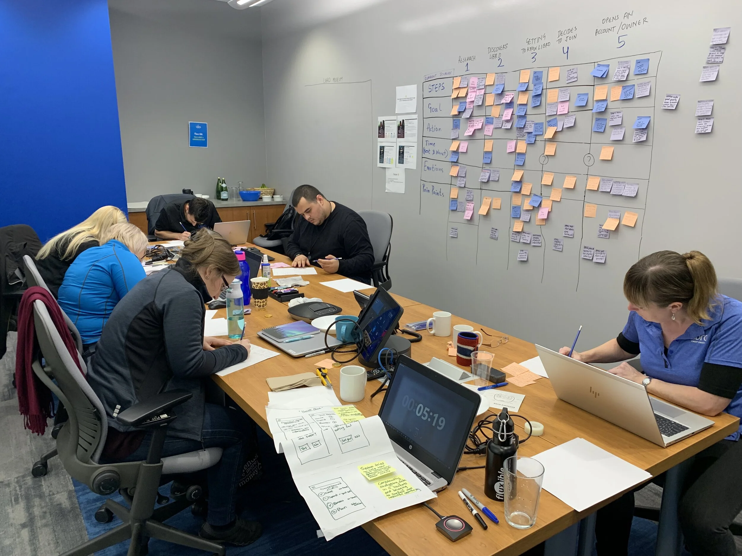
The problem was big enough for us to create a cross-functional team - individuals from the contact center, branches, Digital Banking and marketing department got together. At every step the team brought forward customer pain-points which were not common knowledge.
I facilitated the Sprint which lasted over a span of 3 days.
At the end of the Sprint everyone walked out with a better understanding of User Experience, a sense of accomplishment having provided their insights.
My takeaway was gather the decisions we made and turn it into an interactive User Interface based experience and present it back to the group to refine it further.
3. Information Architecture
I took the data from our Sprint and constructed an Information Architecture (IA) to run it by the team before I began any design work.
The IA made sure we were all in agreement about the workflow.
It helped the team picture Pat’s journey through our website.
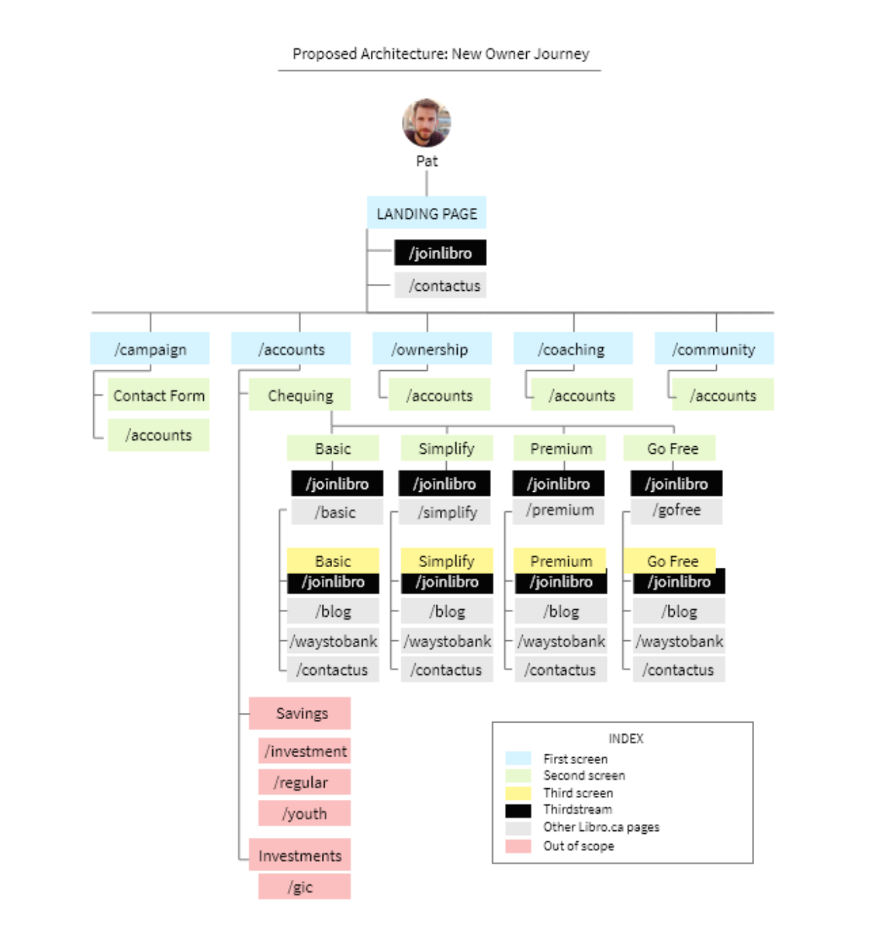
Information Architecture
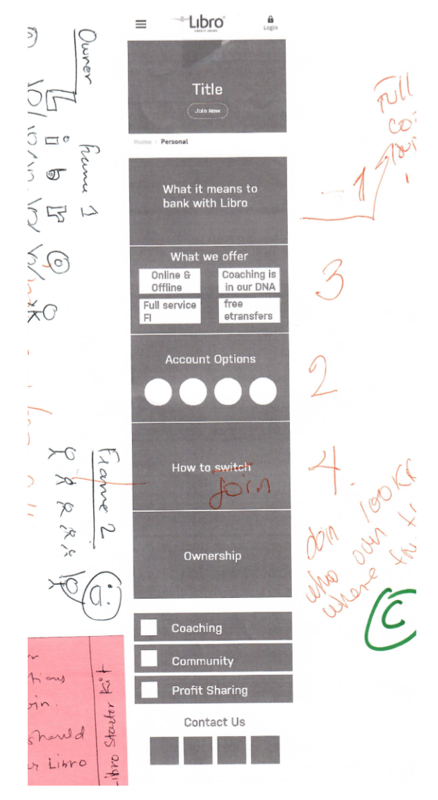
4. Challenge: finding Libro’s digital identity
I ran into an interesting problem during the process of designing the information flow on pages.
Libro had never driven hard conversions online. Most of the conversions happened in person, at a branch.
They had never portrayed their value propositions in an online format. I decided to turn towards Libro’s staff. I ran feedback sessions with new and senior staff to understand their perception of what Libro stands for and how it adds value to individuals and communities.
Staff helped me shape the ideal flow of information a prospect should go through before onboarding.
Finding Libro’s digital identity
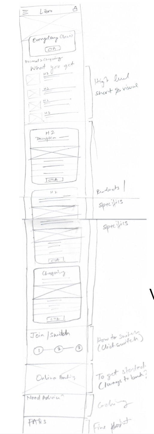
5. User Interface Design: Lo-Fi, Mid-Fi and Hi-Fi
Mobile Experience
Version 1.0
Version 4.0
Version 9.0
Evolution of the Product Card
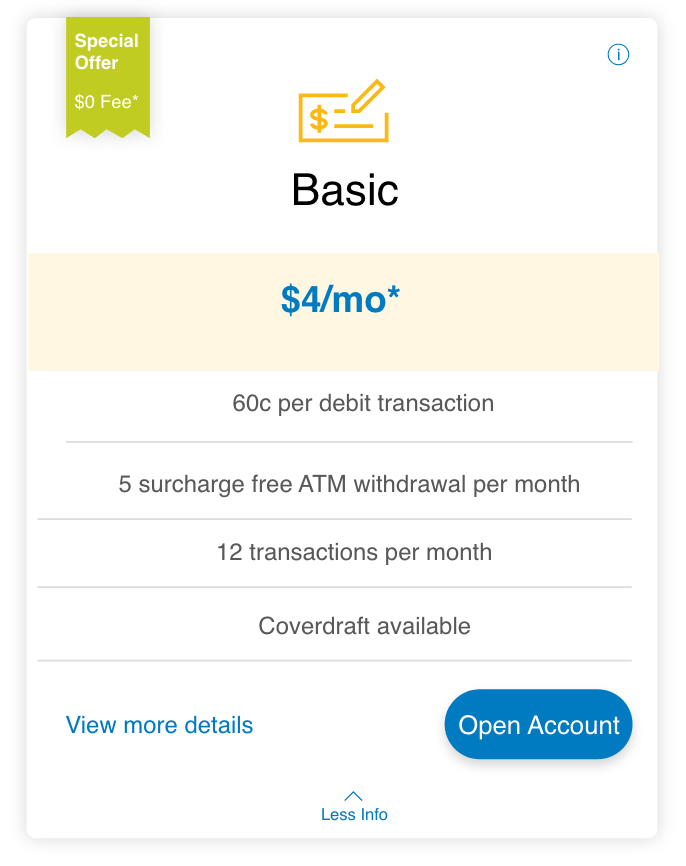
Initial version
Redesign
Refined version